Graphic Design Purposes Through the Eyes of a Front-End Developer
Topic: Team Roles

April 7, 2023
Graphic design is a crucial aspect of software development. This article will explain how visual design impacts software engineering.
Whether you're an experienced e-commerce professional handling multiple websites, or a beginner considering your first foray into the virtual world, I believe hearing from a web engineer can be incredibly valuable in protecting you from costly mistakes. As a front-end developer, I believe graphic design is a crucial aspect of software development.
In my recent project, I began software development without any design. The customer expressed a desire to build a website with a “simple interface” and conveyed that their focus was on the business idea rather than the website's appearance.
While I agree that the business idea is crucial, achieving business goals requires a well-designed website. In my opinion, design is just as important as the idea itself. In this text, I'll explain precisely why design is an integral part of any business strategy.
What is a website mockup front-end developers get from a designer?
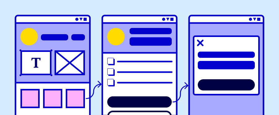
In my work, when a designer gives me a mockup of a page, I get more than just a bright and nice picture. I get a kind of map with a dot I need to hit.

Designers step into the project to make it clear how the end result will look. Together with the customer, they find out and define things like the following:
- A side menu should appear here on the screen when the user clicks on this button;
- On the top, there should be a website header in a particular color with the following buttons in a particular color;
- At the bottom, there should be a footer with company contacts and social media icons;
- Here should be the company logo;
- There will be company staff pictures, and so on;
It seems like that does not sound too complicated, right? This is not the case.
Once the designer has gathered customer preferences, they start to create a website mockup in a graphic design tool such as Figma. It’s a laborious process with a lot of subtleties. It includes tasks like the following:
- wireframe creation for every page;
- font types and size selection;
- color selection for all text, buttons, menus, and backgrounds;
- setting up the appearance of all buttons and input fields;
- selection of background images;
- processing of all images and icons;
- setting up all effects that appear when the user hovers over something or clicks buttons and links;
- implementation of adaptive design to ensure the website will look good on screens of any size (e.g., on different smartphones, tablets, and laptops);
This is where my work usually begins.
How does design help front-end developers work?
Design structures website content
A developer needs to structure a project into components to be able to start working. And they usually do it based on design.
Take the webpage we are on right now there is a header, then a text block with a title, under which there is another text block with a title, then there is a contact form footer and so on. The developer, seeing the mockup of the webpage, can understand how to divide the website into parts and build its logical structure.
As we can see here, the component App (that is our application) has sub-components Header (that is a website header), Main (that is page content), Menu (that is, for example, a dropdown menu), and Footer (that is a website footer). In fact, this is a project structure the developer has built based on the mockup provided by a designer. Thus, cooperating with designers makes it easy for developers to structure the project.
If the developer doesn't have a mockup, things go completely different. It’s kind of like watching a series after skipping the first episode.
In the project I mentioned at the beginning, we were building a platform where young professionals could search for internships and companies could, accordingly, find intern candidates. To be able to start coding, I first had to figure out many things like the following:
- What should the website look like? Can I make it similar to the same type of website, or will it not work for the customer?
- What content should go on the home page?
- What should be in the main menu and where should it be? And so on.
Let me give you an example. One of the first questions I had to resolve was, "What should an intern candidate profile look like?"
I had project requirements stating it should contain an avatar picture, personal information (name, email and social media links) and an experience summary (education, previous work experience, diplomas, certificates, a portfolio). But I had no idea where I should place it on the website and how much space it would take on a page.
Since it’s one of the most important parts of the website, I had to find a way to make it:
- easy and convenient to read;
- small enough, because otherwise it would block access to other content on the page;
I viewed the same type of profile on several social media sites and chose several templates. But all this profile information took up too much space on the screen, whichever way I tried. Even with this block being maximally stretched horizontally, the page needed to be scrolled a lot. So, I wondered if I should move all or part of the profile information to a separate page. The solution I finally found was placing the whole profile into a drop-down menu called an accordion.
It allows the user to hide the candidate profile after reviewing it to see another page content without scrolling. It turned out to be quite convenient, but I spent a lot of time here. This task took me more than three days instead of the usual one day.
Design saves huge amount of developers time
Let me put it this way, design can be a savior for developers, but it can also be their biggest nightmare. Don't get me wrong, I love it when I have the freedom to let my imagination run wild without any strict requirements holding me back. But the more design options I find, the harder it becomes to choose anything. It's like trying to pick a movie on Netflix with a million options, except this time, I'm not just killing time, I'm killing my productivity.
A developer can review similar websites to find different design options. They can also get ready-made website components. There are collections of such components, so-called libraries, on the Internet. For example, I can choose a ready-made Header and Footer in the library and adapt them to the requirements instead of creating them from scratch.

However, a huge selection of these components is also a problem. The more I find, the harder it becomes to choose anything.
What took even more time than searching and choosing, was multiple redesigning. I had to redesign a lot of website elements many times. For example, it was the Header.
I found a ready-made Header that looked fine. However, this impression was spoiled when I added some content to the page. I chose another ready-made Header that fitted better with page content, but I was unable to add necessary elements to it. Any text, buttons and icons I tried to add immediately spoiled the whole picture. Next ready-made Header I chose appeared to look bad in the mobile website version, and furthermore its drop-down menu did not work very well. I could go on and on.
And it's not just Headers and Footers, it's icons, buttons, input fields, font types, sizes, colors, spacing, effects, and the list goes on. Every minor element has to be adjusted and readjusted to make the whole picture look symmetrical and proportional. It's like playing a never-ending game of Tetris, but instead of blocks, it's design elements, and they never quite fit perfectly.
But here's the thing: design isn't just about appearance; it's about user experience. It's not about attracting the owner; it's about attracting the final user or buyer.
And to top it all off, I'm not the only developer on the project. There's two of us, and we have to discuss every design decision in the team. It's chaos, and it never prevents us from endless redesign.
Final thoughts on the project results
The project was successfully finished. One whole month of hard work and dedication, and we made it happen! The customer's requirements were met, and the website's functionality is as smooth as silk. Not to brag or anything, but we totally nailed it!
Now, let's talk about the website's appearance. If I may share my two cents on this project, here are my thoughts and conclusions, as I see them.
How did design absence affect the project?
- Project cost and duration. Lesson learned: investing in a website mockup from the start could have saved us time and money. Sure, skipping the graphic design phase may sound like a bright idea, but my experience says otherwise. Our designer whipped up the design work in days, while our development team (made up of two geniuses, might I add) toiled away for weeks. Plus, the designer's hourly rate is much kinder to the wallet. Don't get me wrong, I'm not talking about an extravagant design here. I'm talking about something simple, functional, and spot-on for the customer's needs. Trust me, it's a wise investment!
- Website appearance and user experience. Now, when it comes to design, things can get a little tricky. Beauty is in the eye of the beholder, but design is about so much more than just aesthetics. It's about creating a user experience that feels like a breeze and organizing content in a way that's easy to digest. Sure thing, there are exceptions to this rule - for instance, if the customer happens to be a designer themselves or already has a mock-up in hand.
In my opinion, it is a win-win situation for everyone when each professional performs their designated role.